


weinmann somnobalance (german) redmed quattro mirage mask
Finally got my data off the machine...
but dont understand the findings..
its actually an average from first day to 259 days..
Therapy pressure: average 8.4 max 16.2
RDI: average 0.2 max 5.6
oba and hypapneas: average 0.4 max 2.6
central a and hypapneas: average 0.5 max 3.1
RERA: average 0 max 0
Flattening events: average 4.8 max 11
Snorring 2min: average 0 max 0.1
leakage: average 4.3 max 32.5
pressure
time related event related
95percent: 13.0 14.5
90 percent 12.0 14.5
50 percent 8.5 11.0
the numbers look really low..but in last 3 months i keep walking up with all the same symptoms again..same brain fog and fatigue
i also have 4 graphs...how do i paste them to the message?..they are pdf files
can anyone tell me what the results actually mean...first time i have ever seen the data off the machine
what could be effecting my sleep...? the data looks low...
the machine is now set to a pressure of 8-18
Understanding data


3 posts
• Page 1 of 1
Understanding data
_________________
| Mask | ||||
 | ||||
| Additional Comments: Weinmann Somnibalance e | ||||


Re: Understanding data
I use a Resmed kind of machine with a ResScan software to show graphs in this website. The easiest way for me to do it is to first print the graphs in my printer on paper. Next, I scan the printout and save it on the desktop of my windows laptop or another file that can hold images, like RECENT downloads. Next, I go to a image hosting website such as http://www.photobucket.com and open an account there (it's free). While inside the account there I ask for a Download, and then I pick the source by browsing my computer's desktop. Once I have it in the LIBRARY in Photobucket they give LINKS to post it in different media. They also offer editing. So I just pick and transfer the LINK for image code for forums and boards (the whole line) and post it here.
Examples.
Graphs from last night:
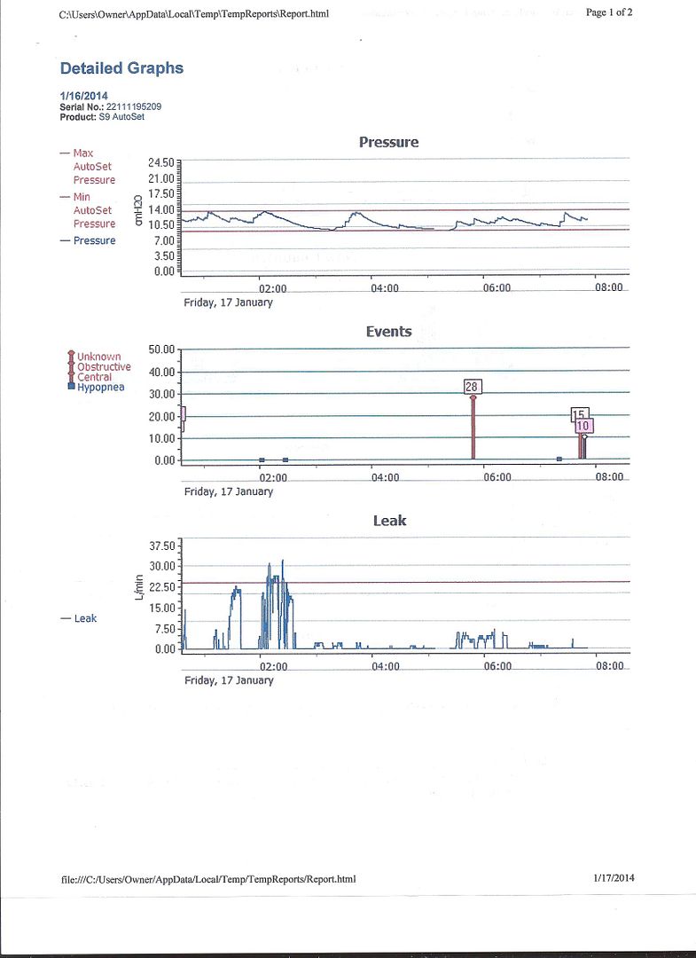
I don't like the Flow Limitation (FL) that I see in my data. You can see that this FL caused my respiration waves to be flattened on their tops instead of rounded. It means that I have some Upper Airway Resistance (UAR) but I don't think that it is a Syndrome yet.

The S9 Autoset machine was OK with these waves shapes b/c it reduced the pressure:
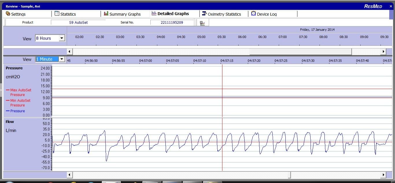
Stats:

Graphs:
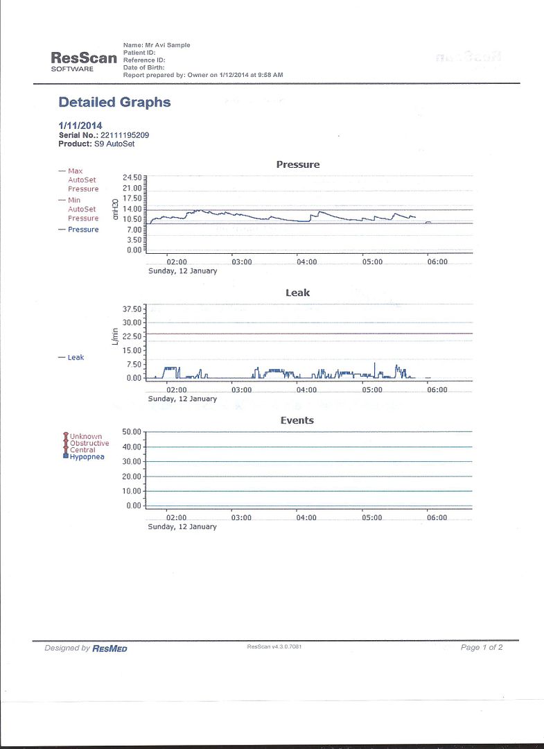
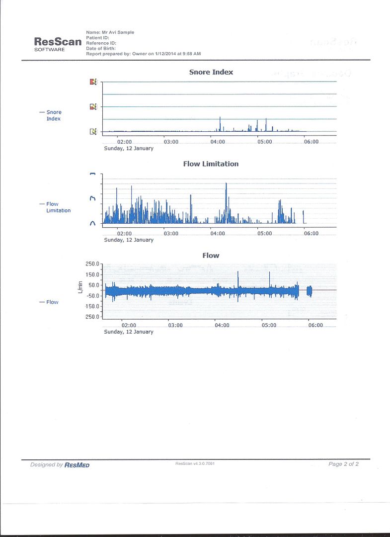
I suggest that you try the SleepyHead software and then you could show here graphs and reports like these:

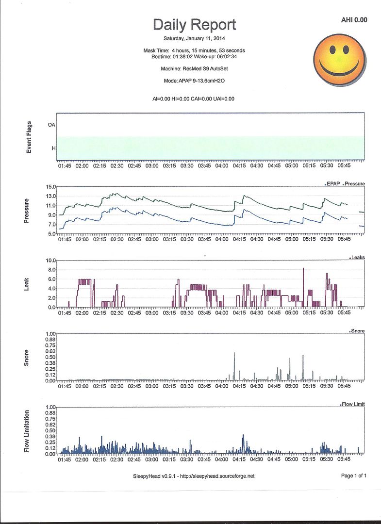
Examples.
Graphs from last night:

I don't like the Flow Limitation (FL) that I see in my data. You can see that this FL caused my respiration waves to be flattened on their tops instead of rounded. It means that I have some Upper Airway Resistance (UAR) but I don't think that it is a Syndrome yet.

The S9 Autoset machine was OK with these waves shapes b/c it reduced the pressure:

Stats:

Graphs:


I suggest that you try the SleepyHead software and then you could show here graphs and reports like these:


_________________
| Humidifier: S9™ Series H5i™ Heated Humidifier with Climate Control |
| Additional Comments: S9 Autoset machine; Ruby chinstrap under the mask straps; ResScan 5.6 |
see my recent set-up and Statistics:
http://i.imgur.com/TewT8G9.png
see my recent ResScan treatment results:
http://i.imgur.com/3oia0EY.png
http://i.imgur.com/QEjvlVY.png
http://i.imgur.com/TewT8G9.png

see my recent ResScan treatment results:
http://i.imgur.com/3oia0EY.png

http://i.imgur.com/QEjvlVY.png

3 posts
• Page 1 of 1