soldamerican wrote:I
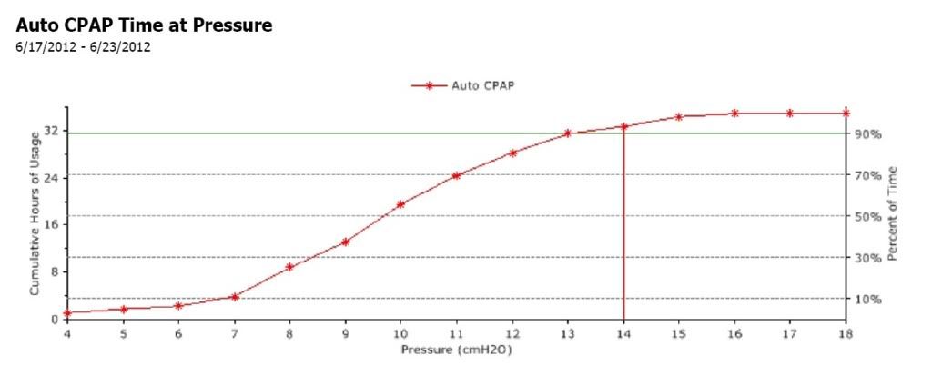
The way I'm reading it is out of 32 hours of usage over the past week the machine spends roughly 90% of the time it's running at 14... but then when you look to the right, by that logic it looks like it would spend more than 90% of the time at 18 (the highest possible)... and that doesn't work out.
Would much appreciate if someone could shed some light on this issue for me. Also, what is the normal range for this metric? How would it look if it was something to be concerned about?
No, you are misinterpreting the graph.
The graph crosses the 90% line right at 13cm, but just barely above 13cm. The point on the graph at (13, 90%) means that you spent 90% of your time AT or BELOW 13cm of pressure. And you spent 10% of your time AT or ABOVE 13cm of pressure. The red line at 14cm of pressure is to indicate that 14cm is the first integral cm of pressure reading AT or ABOVE the 90% and PR uses that as the 90% in these graphs. Technically it looks like 14 is about the 92%---in other words it looks like you spent about 92% of the time AT or BELOW 14cm of pressure.
Finally, since the y-values go up from 90% at 13cm of pressure to about 92% at 14 cm of pressure to about 95% at 15cm, we can conclude that you spent about 5% of the total time with pressures between 13 and 15 cm. In other words, your pressure was roughly 14cm for about 5% of the time the machine was running.
I'll also take the time to point out thatyou spent a bit over 50% of the time AT or BELOW 10cm of pressure since the graph crosses the 50% line just before hitting 10cm. So 10cm is close to your
median pressure or your 50% pressure. Note that
median is not the same as average.
Today's math lesson is brought to you by RobySue, the friendly math prof.