lars4life wrote:
I wish I could understand leaks better.
You and I and many others wish we could understand the leak data provided by the PR S1 better.
From what I've read, PR system 1 cannot figure the mask intentional leak, thus cannot determine precisely unintentional leaks?
Unlike the Resmed S9 there is no setting on the PR S1 or in the Encore Software that provides a spot for inputing the mask or type of mask you are using. But be aware: On the S9, that mask setting just allows the S9 to figure in an
approximate expected, intentional leak rate, which it then subtracts off the leak data before displaying it. So the leak lines posted from ResScan often appear much flatter than they actually are when the machine is detecting no unintentional leaks. I never actually found out what those approximate intentional leak rates in the S9 and ResScan algorithms were. Nor did I ever find out if they were "fuzzy" in the since of treating total leaks between two separate numbers as 0.0 L/min unintentional leak rates.
Furthermore, there really isn't a
precise intentional leak rate for any given mask at any given pressure. The expected leak rate is (or should) always be given with a margin of error: Mask A at Pressure B has a built-in leak rate of 22 L/min +/- 3 L/min means that the expected leak rate could be anything between 19 and 25 L/min.
And because there really isn't any kind of a
precise intentional leak rate for a given mask at a given pressure, there's never a way to compute a
precise unintentional leak rate.
So, just select "unintentional leaks" instead of "total leaks" and the line graph will show leaks from a baseline of zero? Acceptable leaks is a more flat line graph, with few spikes.
Correct me please or add more info if you can.
Regardless of whether you select "unintentional leaks" or "total leaks" the bottom of the leak graph will be labeled
0. But the meaning of that
0 changes.
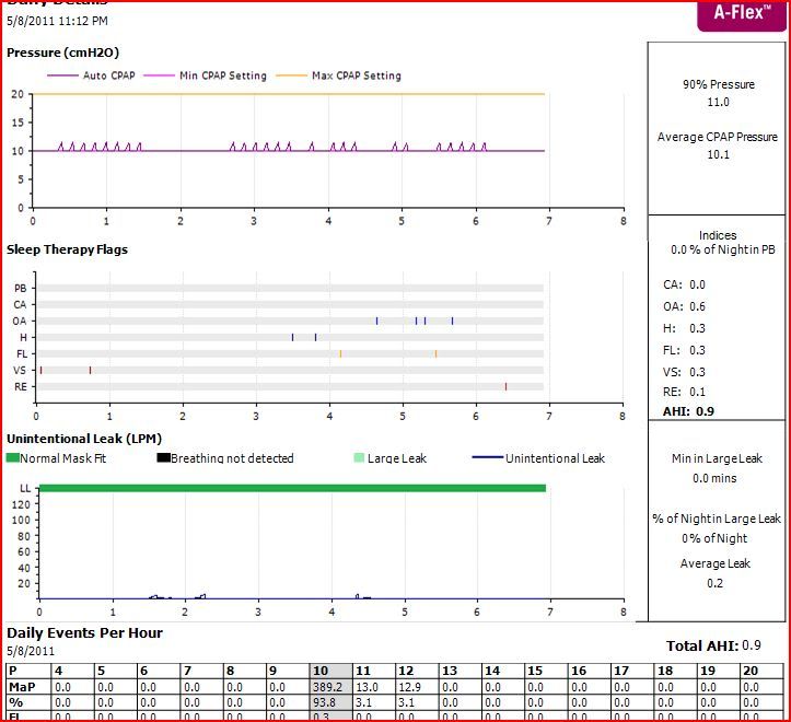
Total Leak Rate Graphs in Encore
In the Total Leak Rate graph, the
y = 0 line means NO AIR at all is leaking from the exhaust vents of the mask or anywhere else in the system. So the leak rate should never drop to
y = 0 since that would indicate the exhaust vents are COMPLETELY blocked AND the mask is extremely well sealed. Not a good thing since you'd be rebreathing CO2 in this case.
So what does an excellent leak line look like if you use Total Leak Rate Data? It should be flat (or fuzzy flat with a minimum amount of very small wiggles) and located somewhere near your mask's published intentional leak rate for your pressure. And by "somewhere near" I mean it's either between or very close to:
y = Published leak rate + published margin of error
and
y = Published leak rate - published margin of error
A "good" leak line might have a few smallish bumps above the rest of the line, but not many and not very high ones. And NO spikes or BIG bumps.
To make this concrete: If your mask's leak rate at your pressure is described as 22 L/min +/- 3 L/min, you want your leak line to look flat or fuzzy flat and be located somewhere between (or not far from)
y=19 and
y=25 when you are looking at Total Leak Rate Graphs.
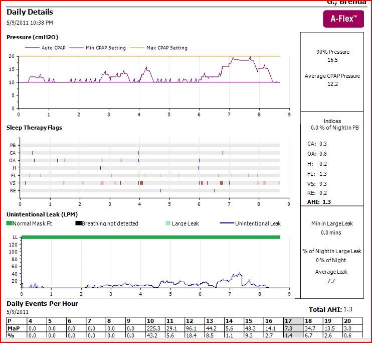
Unintentional Leak Rate Graphs in Encore
When you select "Unintentional leaks" in Encore, the graph shows leaks from a baseline of
y = 0. And the
y = 0 line is supposed to indicate that there is NO
unintentional leaking going on. This would indicate that the corresponding point on the Total Leak Rate graph had a
y-coordinate equal to the
intentional leak rate for the mask at the given pressure. But since Encore and the S1 have no provision for entering mask information, no-one knows exactly how Encore decide what number to subtract off the Total Leak Rate to convert it to the Unintentional Leak Rate. My best guess as a mathematician? Encore is doing some kind of statistical analysis based on the
flattest and
lowest parts of the overall leak curve to get a decent guesstimate of the
estimated intentional leak rate and then it adds on some (small) margin of error, which is also based on some kind of statistical analysis. And then my guess is that Encore computes the Unintentional Leak rate data by first defining:
magic number =
estimated intentional leak rate + a small margin of error
And then it subtracts
magic number from all the Total Leak Rate data to create the Unintentional Leak Rate data. And at the same time, Encore re-defines any
negative Unintentional Leak Rate data as 0. (Negative Unintentional Leak rates result from places where Total Leak Rate <
magic number.)
The result of this process? Well, first, this simply translates the original Total Leak Rate graph down by
magic number of units. And second, the "fuzziness" is taken out of the part of the Total Leak Rate curve where there's no real leaking going on because any place where Total Leak <=
magic number gets plotted directly on the
y = 0 line of the Unintentional Leak Rate graph.
So what does an excellent leak line for an Unintentional Leak Rate graph look like? Absolutely flat and on the
x axis for the whole night. And a good leak line is flat except for a few small bumps here and there.
Is one better than the other?
Not really. They show the same data. However, if you ARE having some middle and large size leaks that you are wondering about, using the Unintentional Leak rate graph will make it easier to figure out just how large those leaks are.